
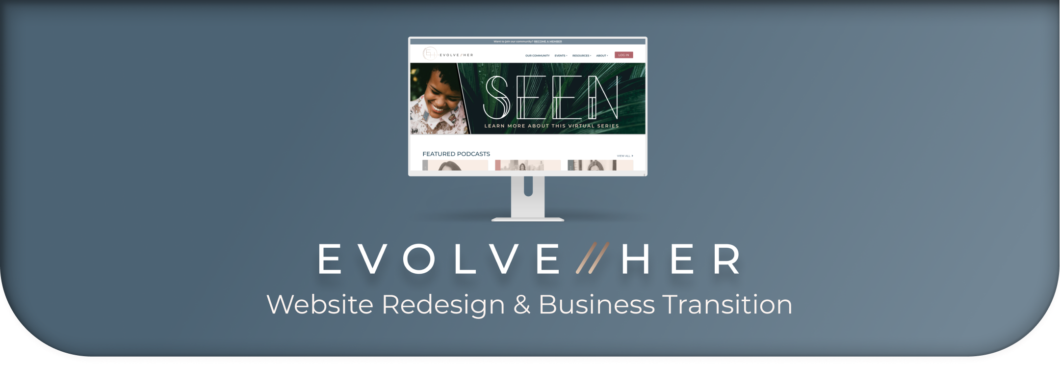
Client Overview
EvolveHer provides curated resources, tools and connections to help advance women personally & professionally. They started as a physical space and are moving their community online. EvolveHer opened her doors January 2018 as Chicago's first event & workspace designed for women. Over the past two years EvolveHer has hosted 750+ events, connected over 70,000 women and worked with top thought-leaders, corporations, disruptors & change-makers.
Project Overview
EvolveHer is mid transition from an in-person co-working space to an online digital resource hub and community for women. To help EvolveHer make this transition it’s essential to find and highlight what users love about the EvolveHer experience and bring that to their web presence. Currently, EvolveHer would like to focus on the overall user experience and flow of their website. The site struggles with consistency across its UX language and features.
Role
UX/UI Designer
Lead Visual Designer
Responsibilities

Time
3 Week Sprint
Tools

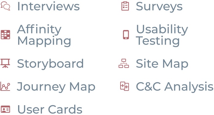
Research Methods
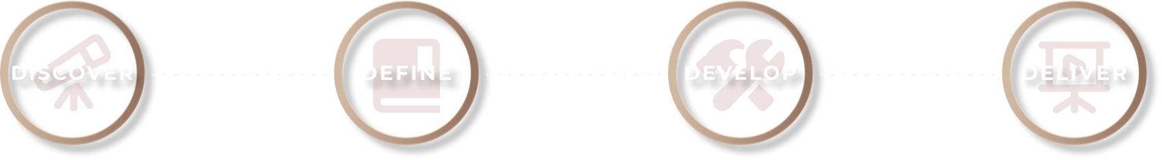
Project Goals
Hi-Fidelity Prototype:
shows consistency throughout features of the site
Detailed Site Map:
highlight revisions and explain reasoning for new structure
Usability Tests:
show that users are able to navigate the site with ease (find events, search directory, review member highlights, etc.)
Interviews
We conducted 6 interviews, 3 with current EvolveHer members and 3 with non-members.
Questions for EvolveHer Members
- What drew you to join EvolveHer? When did you join, and how did you find the community?
- What is most impactful about being a part of the EvolveHer community? Why?
- How has EvolveHer maintained connection and community throughout COVID?
- What type of virtual engagement keeps you informed and included? Why?
- Are you a part of any other professional (or other) communities?
- What do you find beneficial about these communities?
- What services or platforms do you use for networking?
- How do you use social media? Why? Do you use it personally? Professionally? How frequently?
- Do you engage more frequently on social media through an app? What about those apps are better than using the web version?
Questions for Non-EvolveHer Members
- Have you used a co-working space before?
- If you have not used a co-working space, why?
- If you have stopped using a co-working space, what made you stop?
- If you have used a co-working space what is the appeal?
- How has/was your co-working space engaged with you or other members during COVID? What type of programming, networking, etc. have they provided?
- What made your co-working experience good or bad?
- What, if anything, do you miss about an office environment since COVID?
- What would you hope to get out of an online community?
- What are features of a physical or online work environment you would be willing to pay for?
- Do you use LinkedIn, Meetup, Facebook, etc. to broaden your personal or professional network? Which sites do you use and why?
- Have you been interested in a networking resource (similar to LInkedIn) that is more personalized? What types of communities would be of greatest interest to you? (ex. female run businesses, cooking, calligraphy, softball, gaming, etc.) Why?
- What other types of online communities do you belong to? Why those?
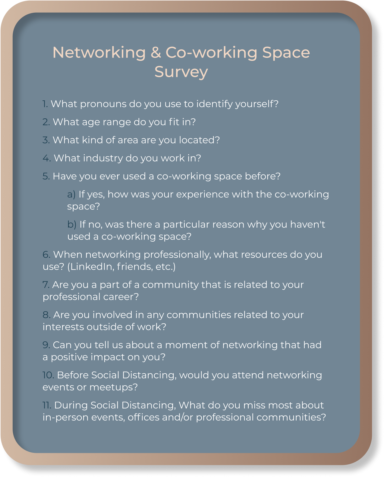
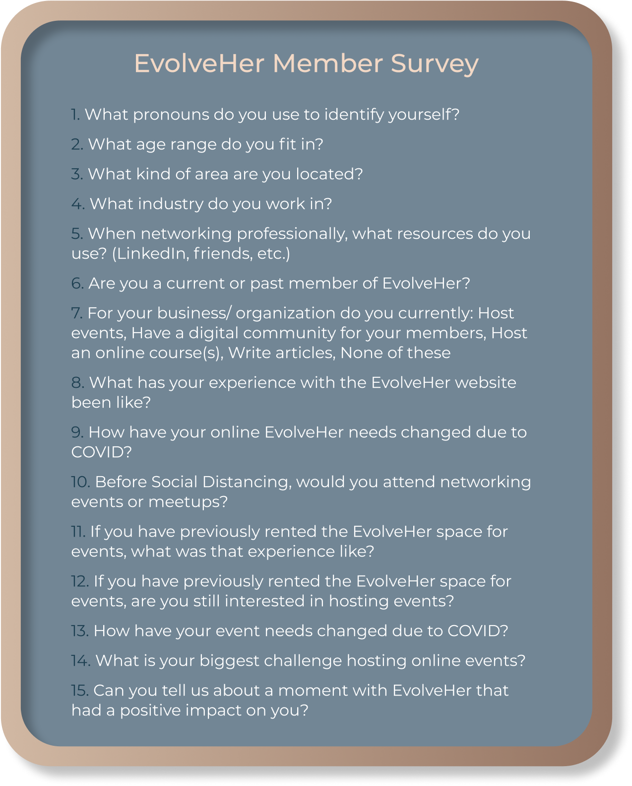
Surveys
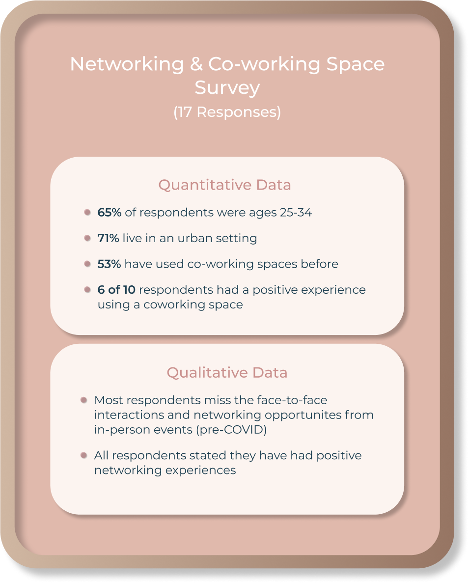
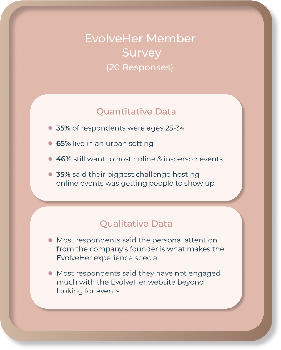
Survey Data
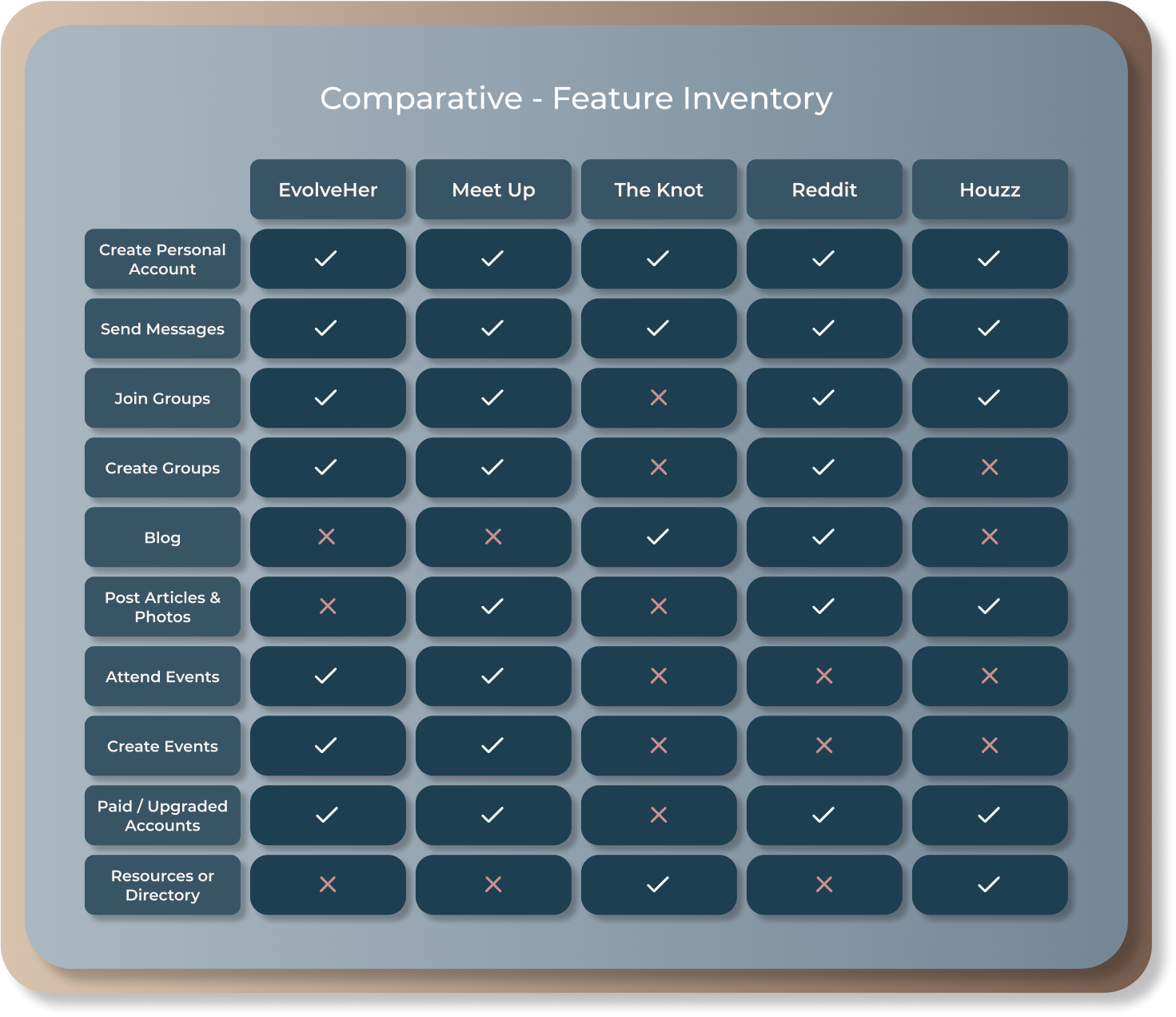
Competitive & Comparative Analysis
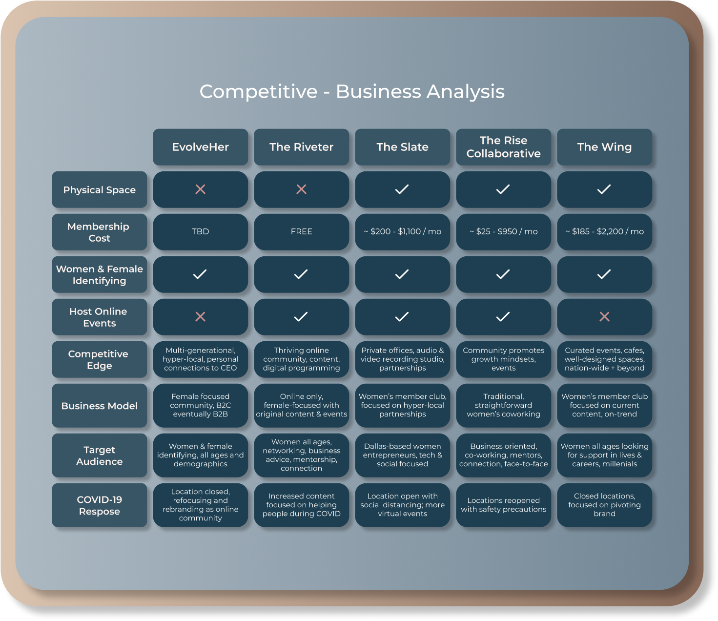
Takeaways
All of these business are capturing a female and female-identifying audience. Each company offers something a little different that sets them apart.
- The Wing has 12+ locations and the most nationwide visibility
- The Riveter is an entirely virtual community with original content
- The Slate offers amenities not found at other coworking spaces (audio and video recording studios)
EvolveHer’s Competitive Edge:
Multi-generational & hyper-local community, like-minded individuals, personal attention from the CEO, and event space
Affinity Mapping
After conducting interviews we used the responses to create an affinity map, grouping similar ideas together to identify patterns.
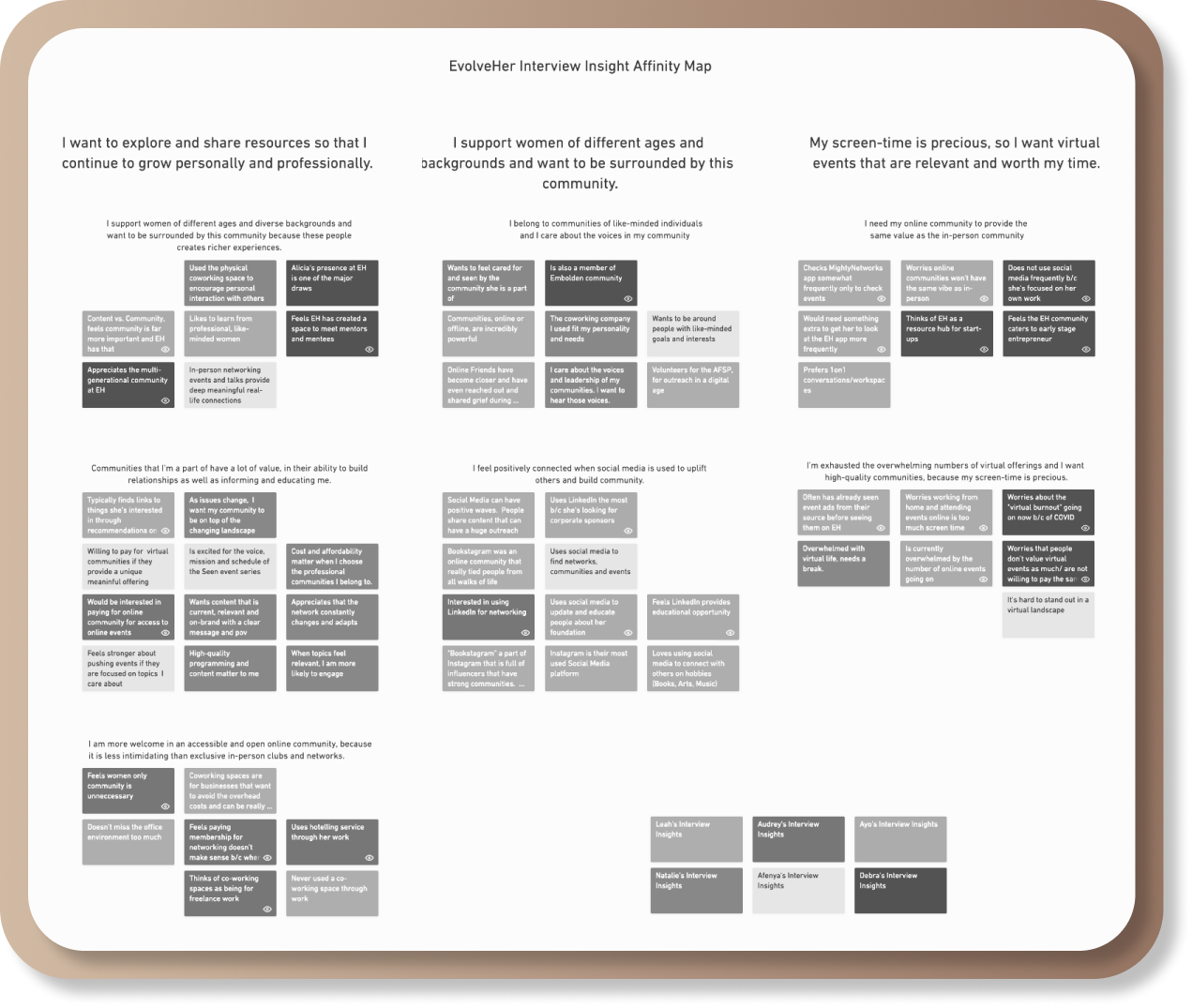
Interview Insights
From our affinity map we came up with these "I" Statement groupings and listed some possible ways to address them.
“I want relevant content because my screen-time is precious.”
How this could be addressed:
- Month calendar view of EVENTS so users can plan ahead
- Highlight featured series so most current/relevant content is quickly accessible
“I support women of different ages and backgrounds and want to be surrounded by this community.”
How this could be addressed:
- Highlight members of the COMMUNITY to add a personal touch a & feel less corporate
- Incorporate new & relevant testimonials
“I want to explore and share resources so that I continue to grow personally and professionally.”
How this could be addressed:
- RESOURCES devoted to strengthening the community & promoting networking and education
- Highlight Featured content relevant to the community and the times
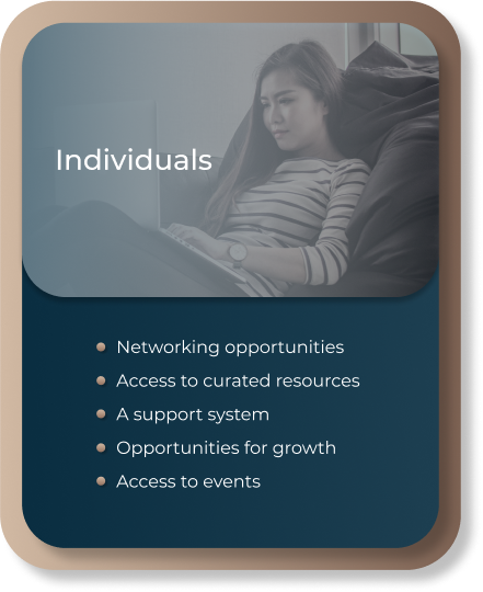
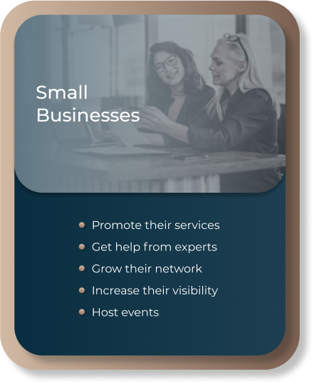
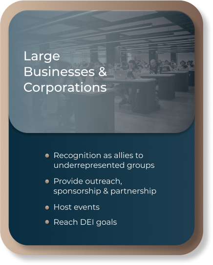
User Cards
We worked with the founder of EvolveHer to identify the 3 distinct user types, then used our research to pinpoint their core needs.
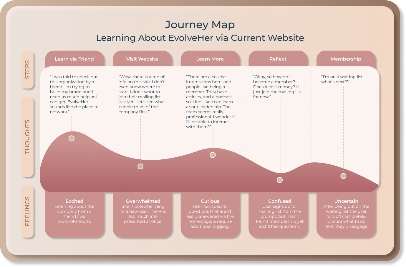
Journey Map
We created a journey map of a new users first experience on the existing EvolveHer website as a way to illustrate the pain points.
The Ideal User Journey
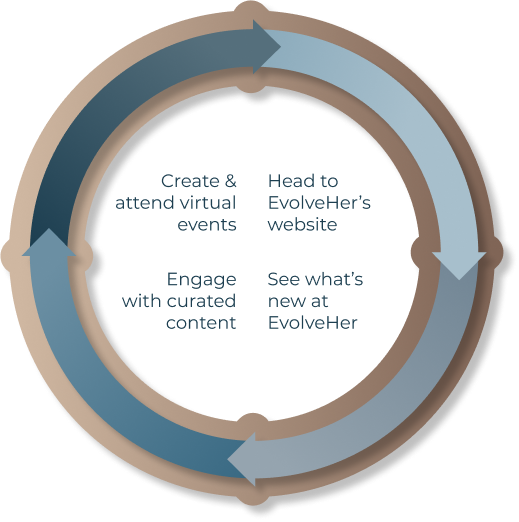
We created another visual to illustrate the ideal user journey as an EvolveHer member. Users would come for content, engage with what's new, stay for events, & continually return for new curated content.
Site Map
Following our research, we addressed the site map, which needed to be updated to reflect the business transition.


Current vs. Revised Site Map
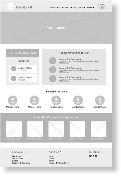
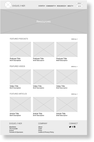
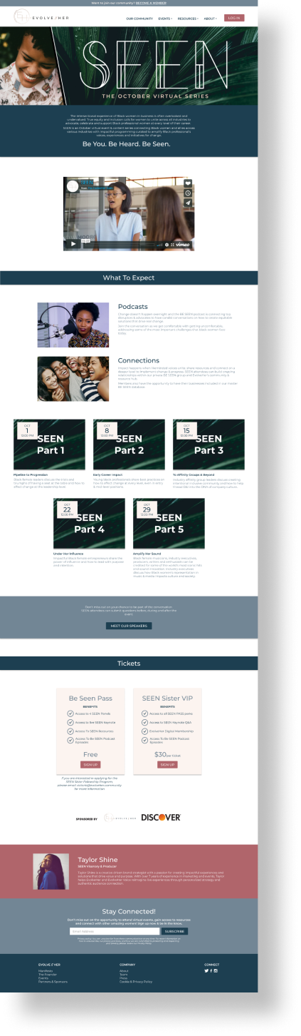
The new navigation features the three areas of focus: COMMUNITY, RESOURCES & EVENTS
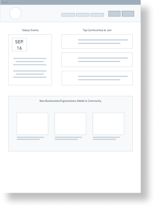
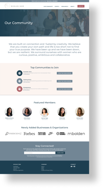
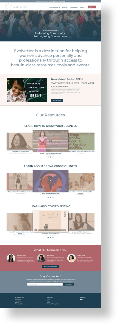
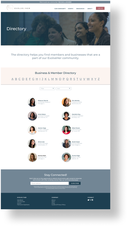
OUR COMMUNITY - One of the things that sets EvolveHer apart from their competitors is their diverse community of women. It's important for new users to see who makes up that community. This is also where users could get a glimpse of the communities and conversations on EvolveHer's Mighty Network site, that is exclusively for members.
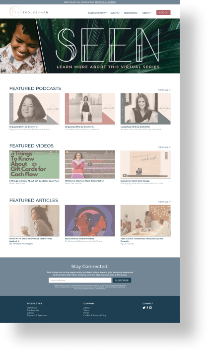
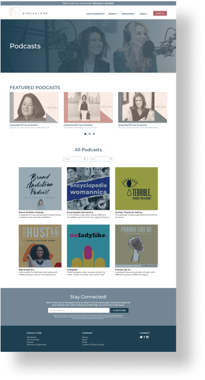
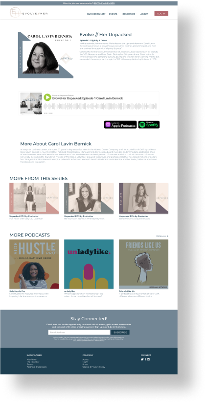
RESOURCES - This drop down was previously the VOICES drop down. As EvolveHer becomes an online community and resource hub it's important for users to quickly and easily identify the content they're looking for. The VOICES title was not as quickly identifiable/understandable to users as RESOURCES.
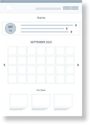
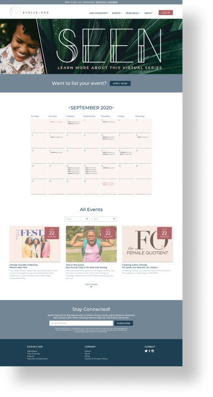
EVENTS - We expanded the EVENTS drop down to include: Calendar, Add Event, and Featured Series sections.
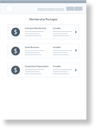
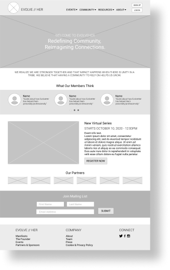
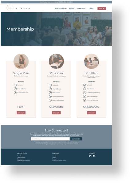
Since growing EvolveHer's membership is crucial, we decided to add a banner above the navigation where users can click BECOME A MEMBER anytime (shown in wireframes). To simplify the navigation we moved the MEMBERSHIP section to the ABOUT drop down.
Design Studio
(Low-Fidelity Wireframes)
After we revised the site map, we ran a design studio to get a visual idea of what we were each thinking the site would look like after our redesign.
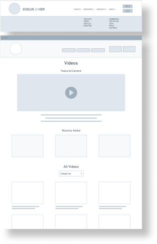
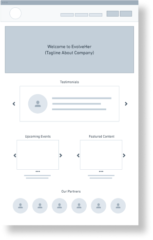
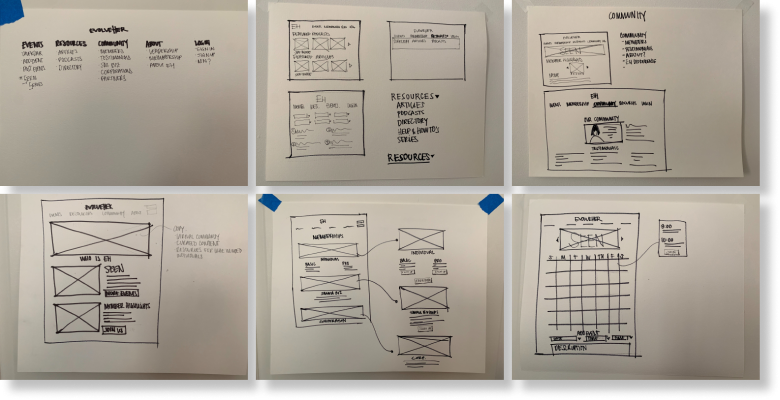
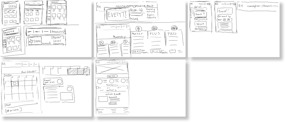
Mid-Fidelity Wireframes
After sharing our low-fidelity sketches, we went over our design decisions for each page and made a list of our 'must-haves.' It was then my job to consolidate our ideas into mid-fidelity wireframes.


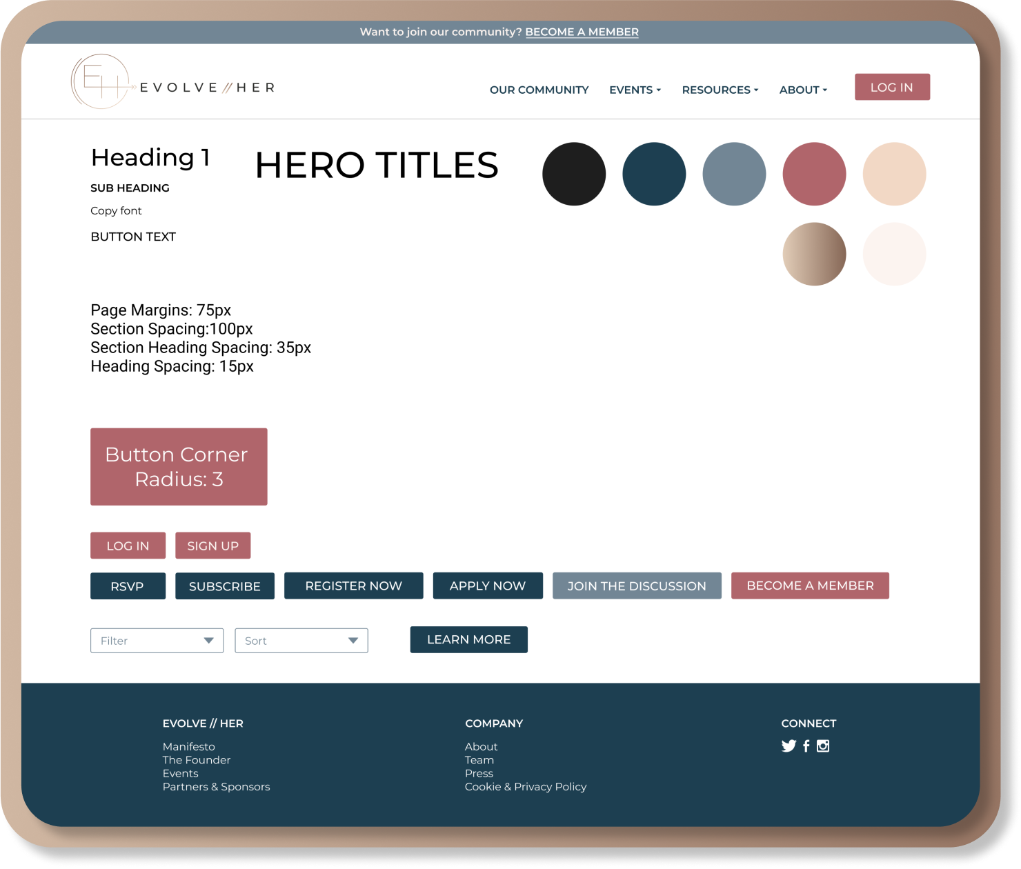
Style Guide
Before starting on the high-fidelity wireframes we established a style guide. Here is a sample of the style guide that was created.
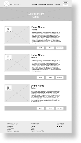
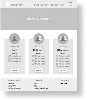
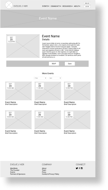
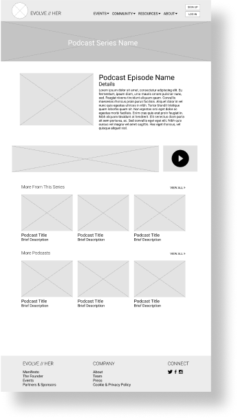
High-Fidelity Wireframes
After several rounds of usability testing with our low and mid-fidelity wireframes we created our high-fi version. These are the wireframes that were presented to the client and used for the final clickable prototype.
Prototype Walkthrough
What was accomplished?
- We created a framework for EvolveHer to use and edit as they grow their content and community. EvolveHer can use this framework and decide what content they want to be available to anyone and what they want to be exclusive to their members.
- We brought EvolveHer's stand-out features, COMMUNITY, RESOURCES & EVENTS, to the forefront of their website, where they are quickly and easily accesible to users.
- We brought unifying consistency to their websites UI.
Future Considerations
- Consider moving the site to a single platform, where members can log in so users don't have to go between EvolveHer's main site and their Mighty Networks site.
- Implement AI to provide curated content for individuals based on their profile.
Design files were handed off & the updates are projected to go live in 2021